
An app with 3M+ downloads, 4.7 stars, aimed at Senior Citizens, for bridging old patterns into digital touch-points for a top government bank.
“If it’s too complex, I’m out of here.” — Lata, 58
"Could you check my balance for me, please? I’ve rung twice and still haven’t got through."
That was something we heard more than once while doing early research in a local branch. And while the bank already had a feature-rich mobile app, it was clear that it wasn’t reaching everyone.
The request came from within the bank’s own IT team, where I was working at the time. The goal wasn’t to overhaul the bank’s main app. Instead, we were tasked with creating a simpler companion app for senior customers—those who often preferred in-person banking but were willing to try digital, as long as it didn’t feel intimidating.
Despite increasing smartphone usage in India (particularly among older users), many long-time customers still preferred visiting branches or phoning in for basic services—like checking a balance.
This created two issues:
We saw this not as a technology gap, but as a trust gap.
As a Product Designer in the IT team, I:
Figma, Illustrator, Photoshop

We used the GLE model to define our product vision:

We spoke to users directly at bank branches and monitored call centre logs.
What we heard:

✦ Discovery & Insight Gathering
✦ Market Research
We looked at what other major Indian banks were doing:
✦ Persona & Journey Mapping
We built around three core user types:
This helped us design with multi-generational use in mind, while staying senior-first.
✦ Wireframing & Prototyping
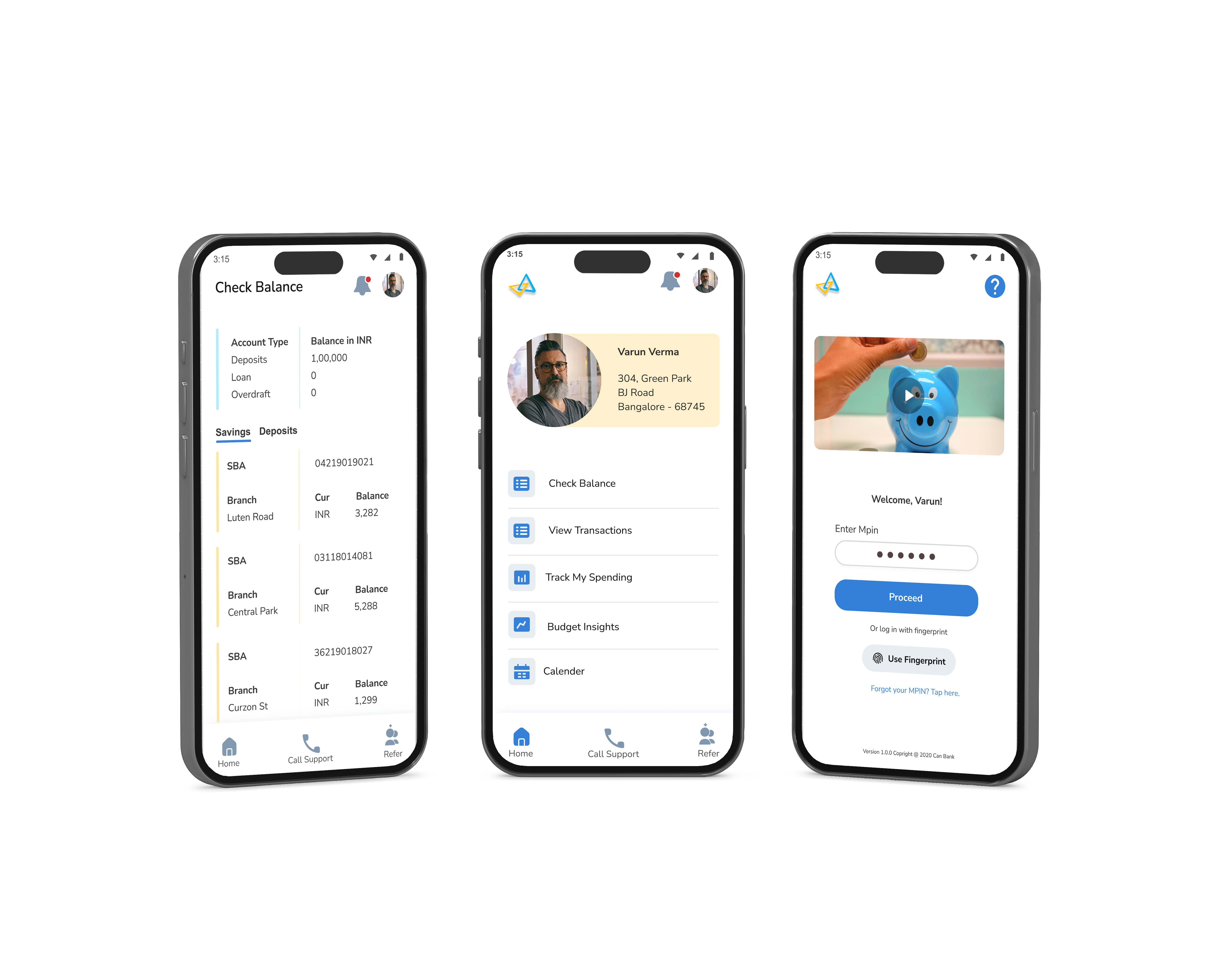
The app had one job: help users feel in control of their money.
✦ Home Screen: Simple by Design, Built for Confidence
We kept the home screen calm and clutter-free — no flashy carousels, no pushy offers. Just simple, easy-to-read buttons stacked vertically for key actions:
We also avoided financial jargon, using plain everyday language so users always know what each section does.
✦ Sign-In Options
Through A/B testing, we tried:
MPIN and fingerprint were the clear winners—fast, secure, and easy to remember.
✦ Designing the Budget Screens: Turning Confusion Into Clarity
One of the most frequently voiced concerns in our early research was around money “just disappearing.” Several users admitted they had little understanding of where their money was going each month. While they weren’t necessarily seeking complex financial tools, they craved visibility and control. We saw an opportunity here — not to overwhelm, but to gently introduce budgeting in a familiar, helpful way.
But designing a budgeting feature for a senior-first audience came with its own challenges. Traditional budgeting apps often rely on charts, categorization systems, and financial jargon. For many of our users, this language created a barrier rather than a bridge. So, we started with a simple question: What would budgeting look like if it felt like pen and paper — but better?
Our Goals Were Clear:
One of the most frequently voiced concerns in our early research was around money “just disappearing.” Several users admitted they had little understanding of where their money was going each month. While they weren’t necessarily seeking complex financial tools, they craved visibility and control. We saw an opportunity here — not to overwhelm, but to gently introduce budgeting in a familiar, helpful way.
But designing a budgeting feature for a senior-first audience came with its own challenges. Traditional budgeting apps often rely on charts, categorization systems, and financial jargon. For many of our users, this language created a barrier rather than a bridge.
So, we started with a simple question:
What would budgeting look like if it felt like pen and paper — but better?

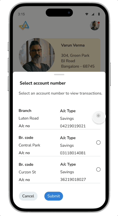
✦ Designed for Shared Trust
“Why can’t my partner check the balance too?”This was one of the most frequently asked questions during interviews with senior users. Many of them shared their phones with a spouse, adult child, or caregiver. Others had limited digital fluency and preferred that someone they trusted help with managing their finances.
To address this, we introduced a Shared Trust Access feature. Users could optionally add a secondary phone number—belonging to a family member or trusted person—who could then access the app in a read-only mode. This allowed both peace of mind and accountability, without compromising on security or autonomy.
We ensured that users were always in control of the feature:
Settings were made accessible via a clear profile icon. Tap it, and you’d get a simple drawer with:
✦ Settings Menu: Designed With Care
Settings were made accessible via a clear profile icon. Tap it, and you’d get a simple drawer with:
Logically organized. Progressive Disclosure. Easy to understand at a glance.
✦ Settings & Accessibility
Designing for seniors meant accessibility wasn’t a feature — it was a foundation. From the earliest wireframes, we made sure every interaction was comfortable and confidence-boosting.
We Included:
Many of our users told us that even with all the technology, sometimes they just wanted to speak to someone. That insight shaped our decision to keep calling a human not only possible, but prominent.By listening to our users and building for their comfort, we weren’t just ticking boxes — we were earning trust.

Designing for seniors meant testing everything. We validated our designs through:
✦ Usability Testing
✦ A/B Testing
✦ System Usability Scale (SUS)
✦ MPIN Confusion
✦ Unhelpful Error Messages
✦ Hidden Support Options
✦ Financial Jargon Barriers
✦ Small Tap Targets
The app now has:
More importantly, it helped real people feel comfortable managing their money.
Designing for senior citizens isn’t about “dumbing things down.” It’s about understanding the rhythms of their lives, their unspoken hesitations, and designing with empathy and respect. Many of our users didn’t want full digital banking — just a simple way to feel in control.
It wasn’t about bells and whistles. It was about earning trust.
“If it’s too complex, I’m out of here.”
— Lata, 58
We kept her in mind every step of the way.
You can reach me at
